

Breve
Rapidly prototyping an AI-powered podcast app in one week
UX DESIGN, UI DESIGN, BRAND DESIGN +4 MORE
In Development
01
01
01
THE CHALLENGE
THE CHALLENGE
THE CHALLENGE
I had one week to create and finalize polished designs for an app that could answer questions with real podcast clips using AI. The app needed to be submitted to an investor group, and the deadline was quickly approaching.
I wanted to create an app that removed as many UI elements as possible, while also bringing a new level of human interaction to the experience. I also wanted to create a brand that appealed to the intellectual podcast listener.


Rapid Prototyping & Wireframes
I rapidly prototyped various layouts that could display the information in different formats, including list views, typographic, cover art and full screen video.
02
02
02
THE VISION
THE VISION
THE VISION
Because most podcast listeners listen to podcasts while multitasking, I understood that a traditional user interface would be less important. This was an audio experience, so I chose to create an audio-first interaction. Instead of interacting with a physical interface, you could communicate with the app directly via voice commands.
After much brainstorming, the name of the app was chosen - Breve. In Portuguese, this means 'brief' or 'quick'. Breve would become the identity and personality of the app that you communicate with.
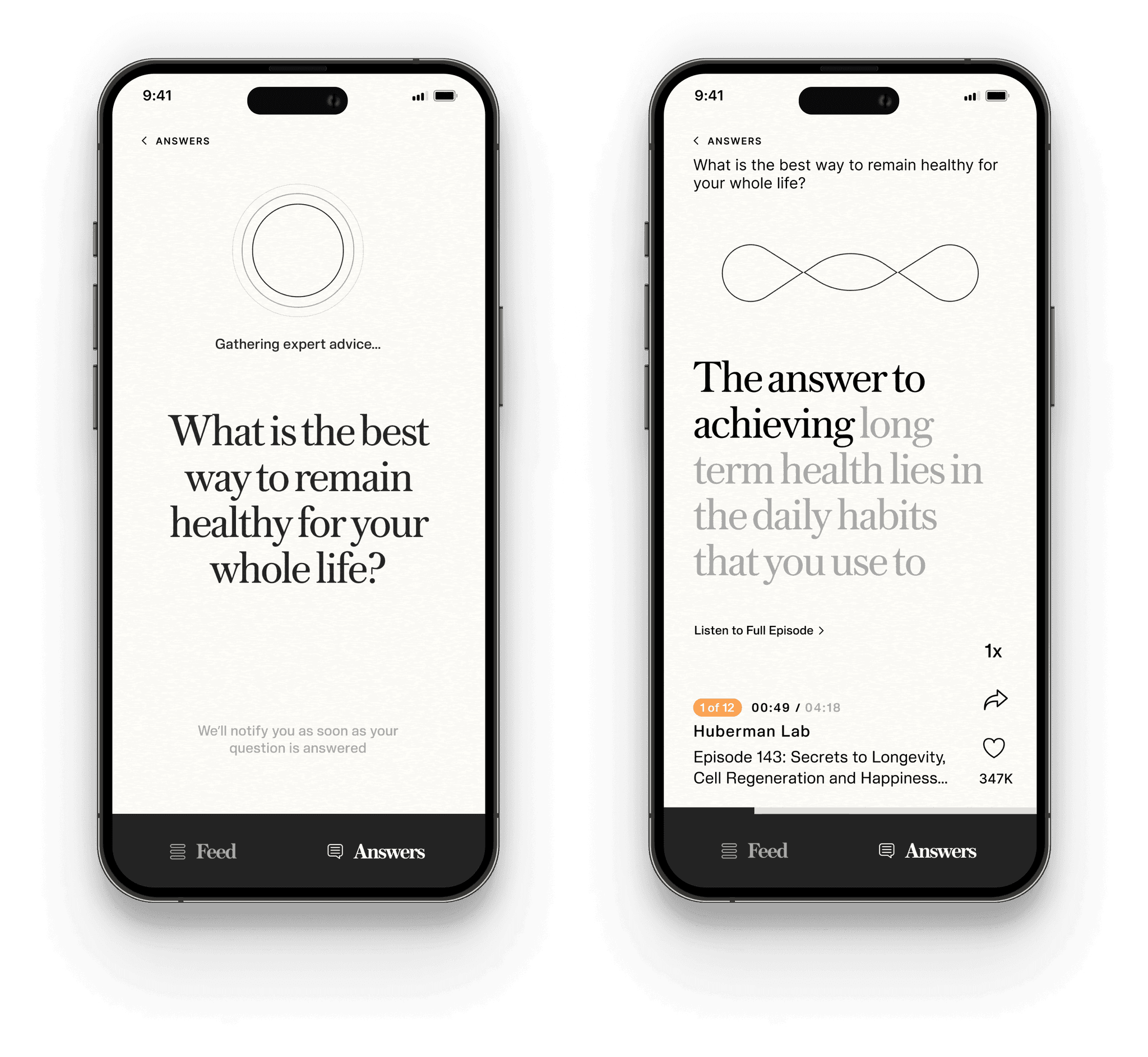
After prototyping various app interfaces utilizing video streaming, cover art, and other layouts, I ultimately chose to reduce the interface to the transcripts only. This would put the focus on the content and give the brand a literary look and feel.


A Streamlined Interface
I chose to remove as many elements from the interface as possible, focusing on the audio-first experience. To optimize for multitasking, the app displays the content in a large text format.
03
03
03
THE RESULT
THE RESULT
THE RESULT
The result is a streamlined, modern AI app that uses new technology to take the next step in human machine interaction.
I also implemented the original concept of an audio-first onboarding. This enables you to create an account and choose your preferences through a simple conversation with Breve.
The result is a streamlined, modern AI app that uses new technology to take the next step in human machine interaction.
I also implemented the original concept of an audio-first onboarding. This enables you to create an account and choose your preferences through a simple conversation with Breve.
The result is a streamlined, modern AI app that uses new technology to take the next step in human machine interaction.
I also implemented the original concept of an audio-first onboarding. This enables you to create an account and choose your preferences through a simple conversation with Breve.


Audio-First Onboarding
Audio-First Onboarding
I designed an audio first onboarding flow, enabling users to onboard with only their voice.
I designed an audio first onboarding flow, enabling users to onboard with only their voice.
04
04
04
THE DETAILS
THE DETAILS
THE DETAILS
To humanize the product I chose to bring Breve to life through the use of an animated waveform that would activate when Breve spoke. Breve would also morph into other forms depending on its state - such as listening or loading.
To humanize the product I chose to bring Breve to life through the use of an animated waveform that would activate when Breve spoke. Breve would also morph into other forms depending on its state - such as listening or loading.
To humanize the product I chose to bring Breve to life through the use of an animated waveform that would activate when Breve spoke. Breve would also morph into other forms depending on its state - such as listening or loading.
Animated Waveform
I created an animated waveform to represent Breve. The waveform activates when Breve begins communicating with you or during podcast clip playback.
05
05
05
THE BRAND
THE BRAND
THE BRAND
In terms of the brand, I used a soft background texture and serif font to create a tactile sense of familiarity. The design appeals to an intellectual audience while retaining a strikingly simple interface.
In terms of the brand, I used a soft background texture and serif font to create a tactile sense of familiarity. The design appeals to an intellectual audience while retaining a strikingly simple interface.
In terms of the brand, I used a soft background texture and serif font to create a tactile sense of familiarity. The design appeals to an intellectual audience while retaining a strikingly simple interface.
Brand Kit
Logo
Fonts
Colors
Buttons
Mark
I chose the waveform as the mark for the brand, bringing a sense of motion and fluidity.
Logo
Because the logo was sometimes featured within the interface, I chose to use the brand font within the logo to create a simple visual continuity.
Brand Kit
Logo
Fonts
Colors
Buttons
Mark
I chose the waveform as the mark for the brand, bringing a sense of motion and fluidity.
Logo
Because the logo was sometimes featured within the interface, I chose to use the brand font within the logo to create a simple visual continuity.
Brand Kit
Logo
Fonts
Colors
Buttons
Mark
I chose the waveform as the mark for the brand, bringing a sense of motion and fluidity.
Logo
Because the logo was sometimes featured within the interface, I chose to use the brand font within the logo to create a simple visual continuity.
Brand Kit
Logo
Fonts
Colors
Buttons
Mark
I chose the waveform as the mark for the brand, bringing a sense of motion and fluidity.
Logo
Because the logo was sometimes featured within the interface, I chose to use the brand font within the logo to create a simple visual continuity.
Brand Kit
Logo
Fonts
Colors
Buttons
Mark
I chose the waveform as the mark for the brand, bringing a sense of motion and fluidity.
Logo
Because the logo was sometimes featured within the interface, I chose to use the brand font within the logo to create a simple visual continuity.